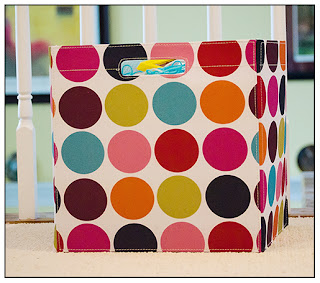
Back to the color scheme.....I love funky and fun colors. So, after trying a few different combinations I took a break, went to clean up the 'art room' as my daughter calls it (really the formal dining room) and noticed this bin...
Thank you Target (read with a French accent) for this awesome bin. I LOVE these colors!! So....that's what I'm going with. Here are 'my' colors.And this is some of my new marketing stuff...
 |
| New business card design on boutique die cut shaped paper! Squeel!!! |
 |
| Referral cards. Front and back, also die cut with rounded corners. <3 |
So, what do you think?? Are the colors fun and funky....or too odd? I'd LOVE to hear your thoughts, advice and opinions. So, leave me a comment below or drop me a line through email/website/facebook.
Also, if you have friends or family in the Richmond area, let them know I'm new in town and to check out my facebook page, 'like' it and I will be offering some 'New in Town' promotions!
And finally.....coming soon........A little bit Rock-n-Roll...
Notice the consistent watermarking...hehe!!
Well, thanks for stopping by! I know this was a little different from my usual client blog posts, but I wanted to share and get some input about all the new goings on. ;-)
~Kerry


LOVE IT ALL KERRY!! Great job, very classy and hip :) You'll pull in more great clients for sure!! I *especially* love the business cards. Conrats on the beautiful house, and Richmond rocks ;)
ReplyDeleteThanks Jessie!! <3 It means so much to get the 'thumbs up' from such a creative person!! :)
ReplyDeleteIt all sounds awesome Kerry! The house looks great and hopefully we will get east this summer to see it. love you guys!!
ReplyDelete